Featured works: France: riverbank
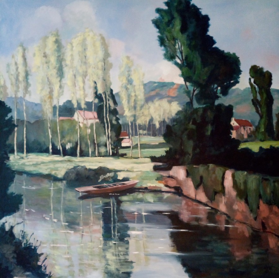
Inspired by a glimpse in a catalogue of painters working in the French Impressionist style, this large painting (c100cm xc100cm) led me to use a limited palette: King's blue, rose madder, dark and very pale greens. I made a few changes to the composition, but aimed to keep the tonal values.
Featured work: Polridmouth triptych
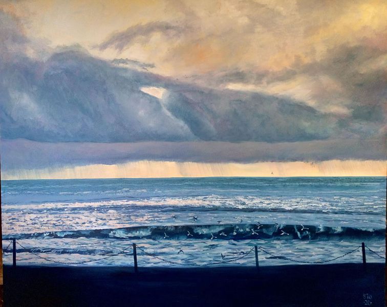
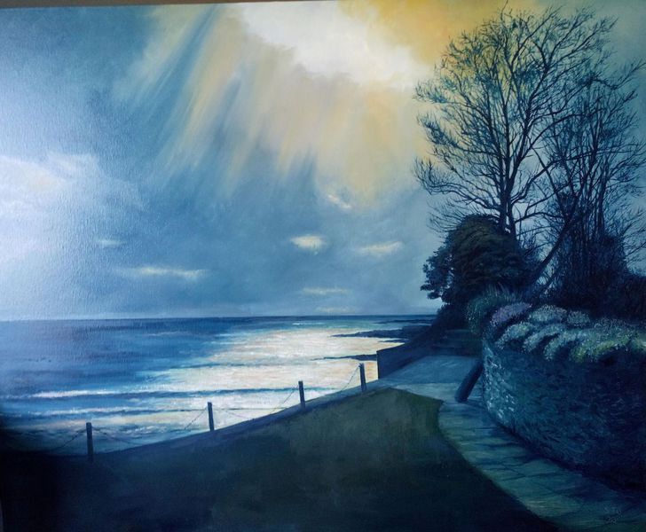
Three large images (all the same size) and strong enough to stand alone, can also be hung together to form a huge 'picture wall', representing Polridmouth bay. Perhaps because it is a place which means a great deal to me, or just because I was on a 'creative roll', but the process of producing these paintings was remarkably fluid and swift. Close scrutiny reveals the colour in the heather above the garden wall at twilight, tiny silhouettes of birds following the line of the promontory, and gulls fishing in the surf in the sunset.
Featured work: In the quiet wood
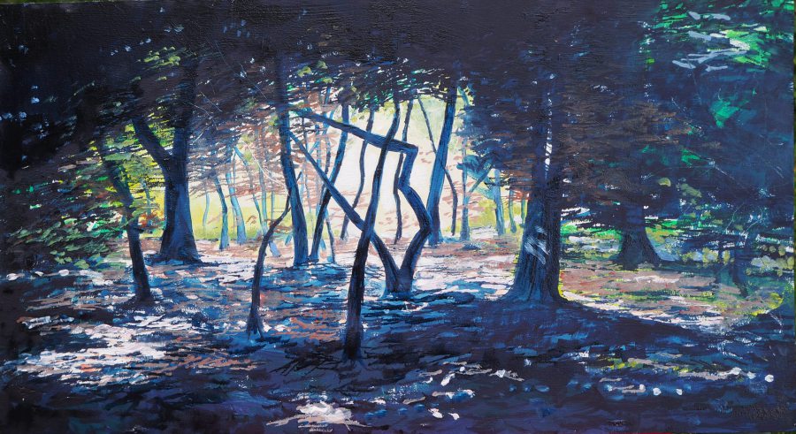
I was in a wonderful garden in Cornwall in September, discovering thickets and glades, circles of oaks, honeysuckle-draped gazebos... around every corner there was a new and magical view. The contrast between thicket and sun-filled clearing was sudden, unexpected and wholly magical. I painted this from images captured in a series of photos, all the while remembering a little piano piece I learned as a child: 'In the quiet wood'. It was my grandmother's favourite. (Collection: S and S Pike.)
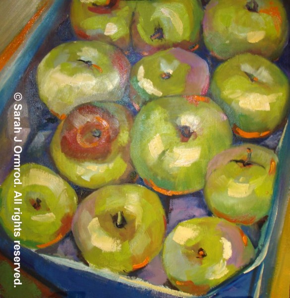
Featured work: Crich pottery
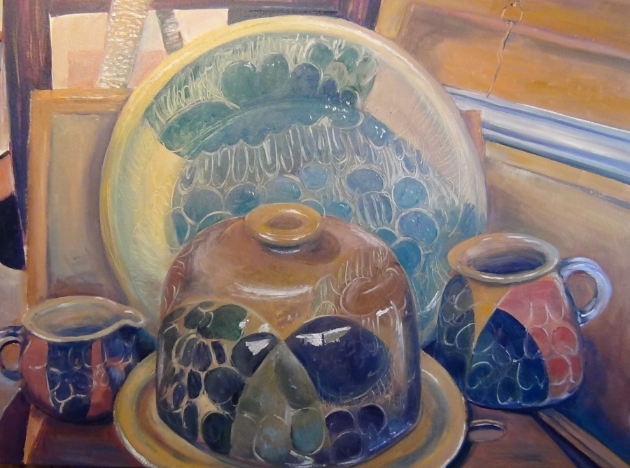
The latest venture is a return to still life, using a collection of Crich pottery for inspiration. I was drawn to these earthernware vessels for their shape, but more particularly for their range of colour combinations and dramatic glazing patterns. The sweeping glaze dips and incised decoration set up interesting contrasts with the vessel shapes and their studio setting. Placing the highlights - to mark reflections and emphasise structure - was the reward after several hours of work on the composition.
Featured work: Giverny: lilypond at sunset
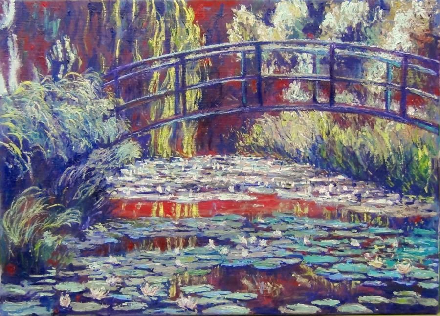
The acquisition of another gilt frame and canvas prompted a recent painting of Monet’s lilypond at Giverny. I studied the series paintings years ago, and my own visit to Giverny in 2011 was followed by several small studies of the pond and its reflections. This painting takes as its starting point the image I found most striking amongst Monet’s many studies of his Japanese bridge: the vibrant red reflections underneath it. The contrasts of red with green, of full sun with shadow, and of the vertical foliage with the lilies on the water surface were the reasons I wanted to recreate the image. (Collection S and S Pike.)
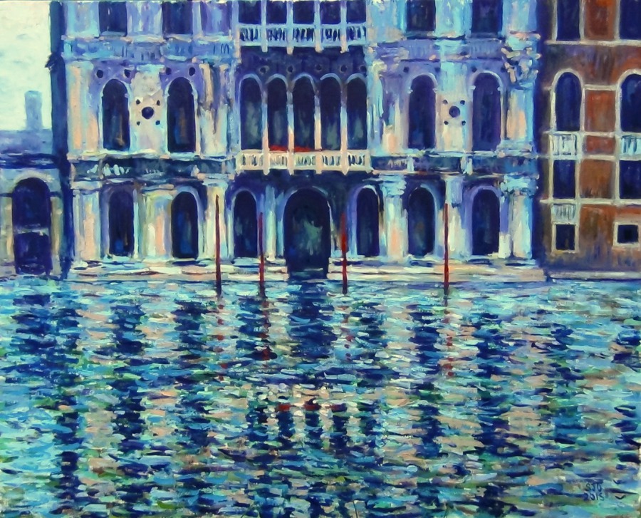
A series develops: Venice, Palazzo Contarini
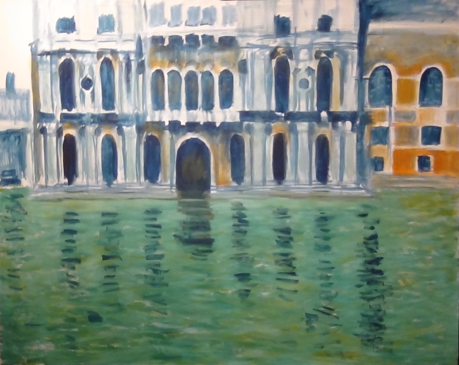
40ins x 32ins Oil on canvas
The starting place for this image was a recollection of a visit to the city many years ago, and the paintings of Turner and Monet, along with reference to drawings of the Palazzo facade. Oil paints allow revision, whilst they are wet, and after they have dried, so one of the challenges of painting in oils is knowing when to stop. It is all too easy to re-work, and loose freshness, and good passages in the process. It's therefore useful to me to photograph the images at different stages. In this first sitting, I sketched out the facade in Prussian Blue, and then began to apply colour. This was the result after about 90 minutes.
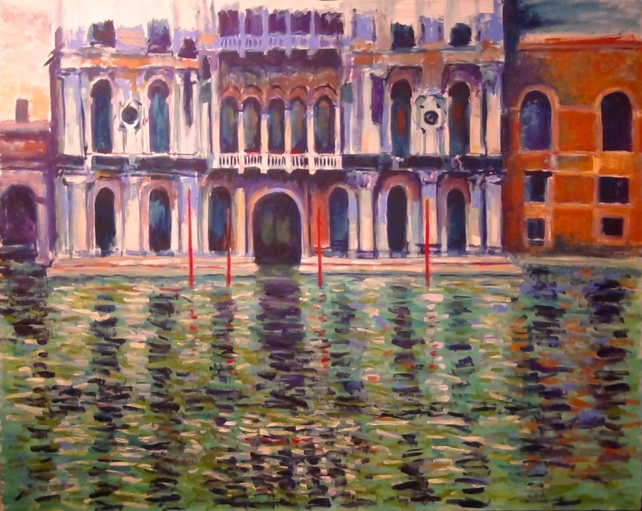
In this next sitting, of about 2.5 hours, I have applied more paint, working up areas of light and shade in the archways and balconies, and in the reflections in the water.I was tempted to wait until the painting was much further along before applying the flashes of red in the mooring poles and on the balcony, but wanted to see the effect. At present, the decision is to leave unfinished to top left corner of the image, which gives the painting an energy, and enhances the impression of a scene glimpsed in haste from a vantage point on the river.
The opportunity to see both stages allows me to plan where next: I need to attend to the tone of the house to the right of the Palazzo, and to consider the tops of the buldings. There's more to do 'tidy' the proportions and horizontals, and the architectural detail, before adjusting the reflections. Finally, the colour relationships in the 'stage 1' (early) version greatly appeal: I need to decide whether to try to return to that colour palette in the final stage, or to start another painting which more closely matches the the 'stage 1' in colour. There is much to be learned by looking for some time, before lifting my brushes again.
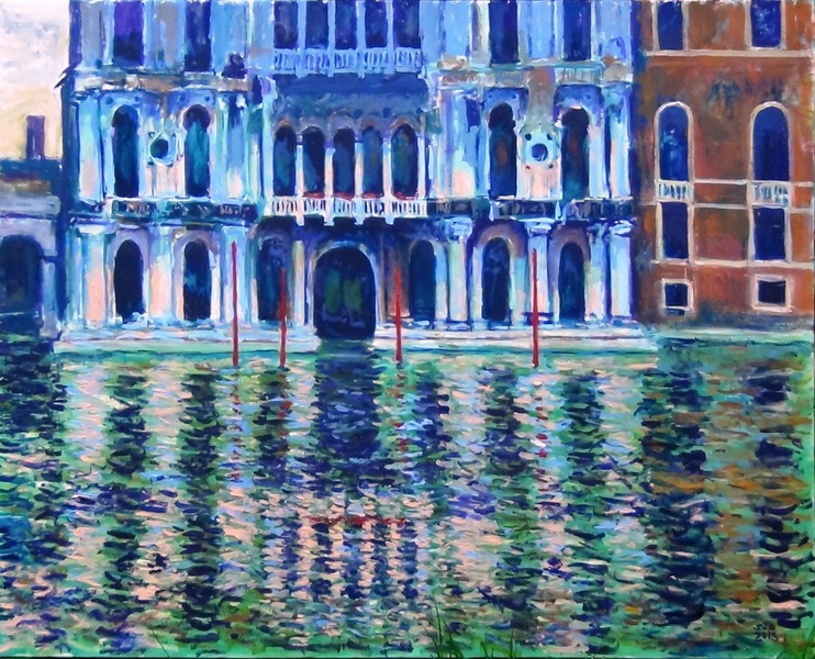
Studying his approach encouraged me to use the oils more freely, and apply them more thickly than I traditionally do. Painting the same image three times was both enjoyable and challenging, as I had to make decisions about how closely the images needed to relate to one another, and how well each worked in its own right.
In each case, I was impressed by the amount of brightness afforded by the use of King’s blue and a pale pink, which helped to capture the light bouncing off the water. The combination of the scale of the paintings (two at 32”x40” and the third at 24”x32”), the broad palette and the density of paint, has resulted in a set of images which change quite dramatically in different light conditions, mirroring what happens in nature.
Featured work: Allan Ramsay
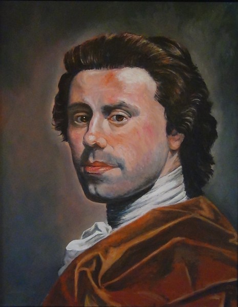
16ins x 20ins Oil on canvas
This featured work represents the most recent attempt at shaking the cobwebs from the corner of my studio which is still accessible, and doing the painting was the equivalent of piano scales (though much more enjoyable than my childhood memory of those!): in other words. much-needed practice. Work and other commitments have kept me away from the easel for too long, but a recent programme about the paintings of C18th Scottish artist Allan Ramsay reminded me just how much I admired his skills. I knew I would not come close to his refined brushwork, but began as he did, with a red sketch, and worked from there. This represents work over two-and-a-half days, with four or five sessions amounting to a total of perhaps 12-14 hours' work. The passages which gave me the most trouble were - as always - the eyes and mouth. I also found that my initial brush sketch was wide of the mark when it came to the real shape of the face and its size in relation to the eyes (where I began), and as the painting progressed and I spent more time observing, I needed to extend the forehead, chin and cheek to get the proportions closer to Ramsay's original. Even though I am out of practice, I did at least adhere to one piece of wisdom: knowing when to stop, rather than overworking the picture. I relaxed a little and was less slavish in copying the jacket, necktie and hair. The next attempt will be better, but for a practice piece after too long a break, I was satisfied with my attempt.
I found the frame the next day in a local charity shop, and painted it matt black, but will varnish it later. The painting itself will need some glazes when it is fully dry, and with those I hope to reduce a little the impression of separate brushstrokes. I used a larger brush than Ramsay, and the picture is necessarily more painterly as a result.
After a few days' observation, I had to come to the unhappy conclusion that Ramsay's right eye - although a part of the painting with which I was most pleased - was in the wrong position, and needed to be moved. I had to bite the bullet, and re-paint the eye, adjusting several other parts of the face and the shading in the process. The re-worked version is a better likeness.
Featured work: Sketch after Van Gogh, Landscape at twilight, Auvers-sur-Oise, 1890
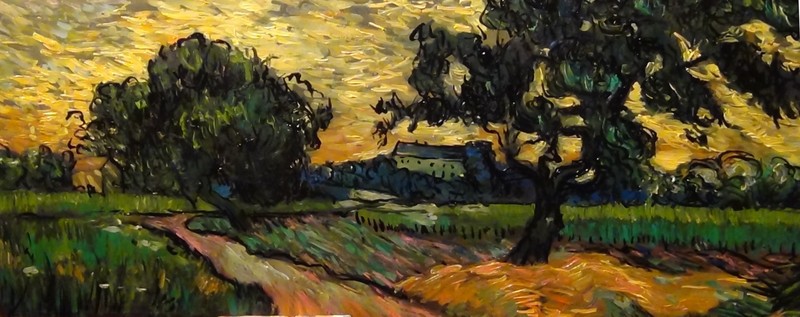
8ins x 20ins
A black frame of the right proportions and depth - spotted in a charity shop - inspired this sketch after Van Gogh. Normally, I take considerable time and care to reproduce a close copy, driven to explore the artist’s original colour contrasts. This time I allowed myself to be less fastidious, and see how much of the ‘flavour’ of the original I could capture in a short time. This first stage took three hours.
Looking is as important as painting, so this next stage is when I need to assess the ‘problem areas’ and to identify those part which need very little additional work.
The area in the top left does not, to my mind, need much more attention.
I'm pleased with the light effect on the building, and the balance of both brush-strokes and colour. The sky on the far right-hand side of the picture needs to be a little lighter. The ground vegetation either side of paint, and was far too rushed. I shall look more closely at Van Gogh's own treatment of these areas. The large tree on the right - particularly around the main limbs - needs the most attention, in order to emulate more closely Van Gogh's brilliant representation of trunk, boughs and foliage.
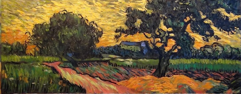
Another two hours’ work, and I reached a point where I was comfortable with the painting. I reworked the yellows, ensuring that the tones resonated more closely with the rest of the sky. In looking at the reproduction of the original, it was clear that I needed to refresh several other areas of sky. My own brushwork is not as direct, by any means. I have blended the pigments and brushstrokes more, and been determined that this was not going to be a slavish copy. It inevitably lacks some of Van Gogh’s freshness, but captures enough to increase my respect for the artist at his best. Having done that, I re-worked the tree foliage and limbs. Here, the improvement from the first session was clear. Closer reading of the original inspired much better definition, with more contrast between light and dark. Finally, I attended to the fields either side of the track. These needed better colour matches: the mud red (alizarin, white, black, vermilion and an orange-red ochre, I think), the orange-ochre heap of straw (or similar) in the foreground, side, the pale green on the path. It was also a challenge to capture something of the apparently effortless but really quite complex combination of strokes in the stretch of land between the two trees on the right side of the path. After two hours, and a brightening of the blue in the roof and the distant trees, I needed to stop. I’m now eager for it to dry enough to be able to see how the black frame will work!
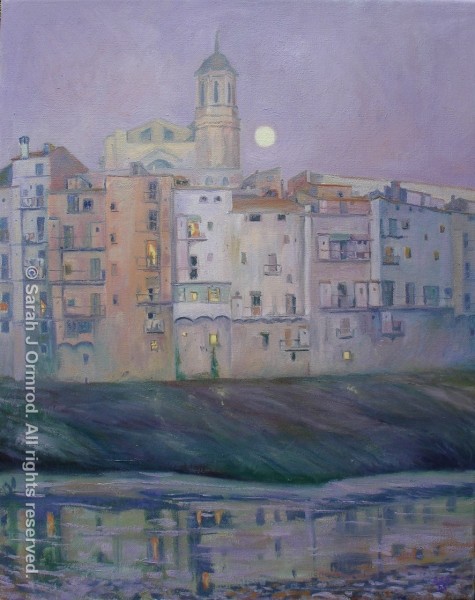
Featured work: Old Girona
49cm x 41 cm, oil on canvas
The nineteenth-century view of old Girona, near Barcelona in Spain, I discovered on a winter visit in 2005. I wrote down the name of the artist of the original, and promptly lost it, but on my return I worked from an out-of-focus and under-exposed photograph and my recollections of the original. The atmosphere of the riverbank, both in this painting and in the (little-changed) reality, was haunting. The colour of the sky took me out of my comfort zone.
The painting is executed in oils, in some places vey thinly applied, and in others (such as the sky and the river) painted more thickly. Some of the most enjoyable passages to paint were the sloping mud bank and the reflected window lights, allowing a little more freedom in handling than the intricate pattern of doors, windows and balconies. I spent hours on this homage to that painting, besotted by a colour palette I rarely use and entirely drawn in by the atmosphere of this magical old town.